According to the US Small Business Administration, colour increases brand recognition by 80 percent. In fact, a whopping 93 percent of consumers say “visual appearance” is the primary factor they consider when buying a new product.
Black text on a white page is an efficient way to communicate basic information. But sometimes you want to do more than just inform people. To turn a potential customer into today’s buyer, you have to make an emotional connection, and colour is one of the most cost-effective ways to do that. Here are nine ways your colour choices can bring new life to your marketing and printed materials.
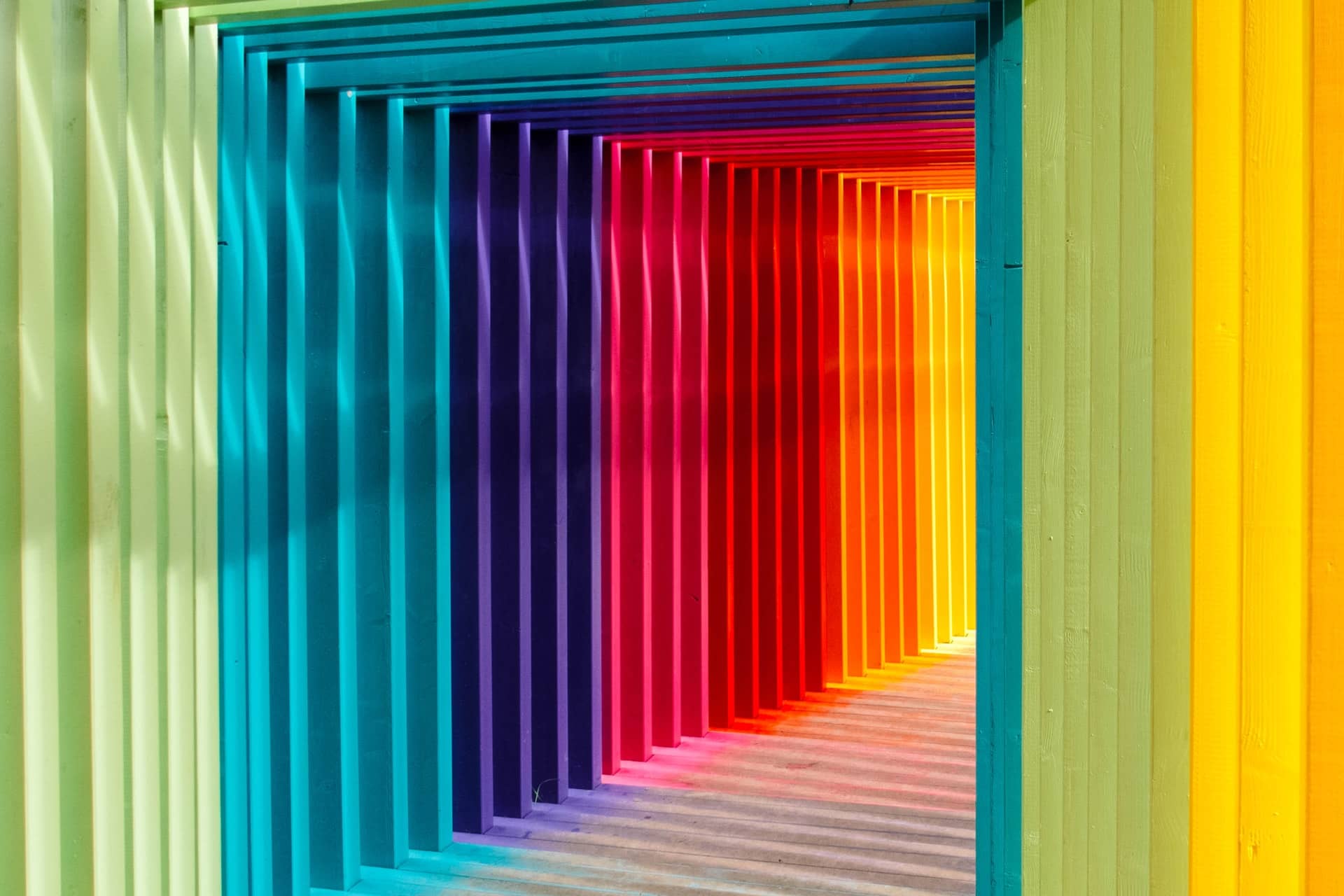
Yellow
If optimism was a country, the national flag would be yellow. Studies have shown that yellow actually triggers the release of serotonin, one of the chemicals responsible for happiness and contentment. Maybe that’s why smiley faces are always bright yellow!
Tip: Yellow is a potent colour, so use it as an accent. Too much yellow can be overpowering.
Orange
Orange symbolises strength, playfulness, ambition, and youthfulness. Orange has much of the same feeling of cheerful exuberance as yellow.
Tip: Consider using orange for the “call-to-action,” in a brochure or product catalogue.
Red
If you want to command attention, red is the colour for you! Red is the colour of alarms, flames, and above all, romance. It’s been proven that the colour red escalates the body’s metabolism.
Tip: The attention-getting nature of red stimulates people to take action – and that’s a good thing for any business owner!
Purple
Combine blue and red and you get purple: the colour of kings. Purple can make your customers feel cool, calm and prosperous.
Tip: Purple signifies credibility. It’s an excellent colour to use in a flyer with a customer testimonial.
Blue
Blue creates a calm, contemplative atmosphere. It’s the colour of a pristine lake, or a cloudless sky. It’s also most people’s favourite colour.
Tip: Blue appeals to a wide audience, imparting a sense of balance and harmony to any printed material.
Green
As the most dominant colour in nature, green represents fertility and abundance. It’s associated with growth involving that other kind of green – money. And it’s one of the easiest colours for the human brain to recognise.
Tip: If your goal is to communicate growth, green is the colour you’ll want to use.
Brown
Brown is a conservative colour, representing humility and quiet confidence. The right shade of brown is reminiscent of fine wood and leather.
Tip: As a neutral shade, brown is useful in balancing out stronger colours. Use it to communicate a feeling of luxury.
Gray
As the ultimate neutral colour, grey selflessly intensifies any colour next to it, helping adjacent colours to “pop.”
Gray communicates strength, sturdiness and longevity.
Tip: Gray is a great alternative to black or white. Use dark grey text to imbue your printed marketing material with a feeling of strength, reserve, and timelessness.
Every detail helps when it comes to marketing materials. Colours affect mood, and can be a sole or contributing reason for product selection in many cases. Examine your schemes carefully when designing your next brochure, packaging, or flyer, and use your hues as a force multiplier – helping to increase the success of your important visual communication tools.